Saturday, September 29, 2012

Introducing ....

Introducing the 2nd collection from our Charming Button range - Nature Charming Buttons.


This collection consists of an assortment of colourful buttons adorned with some of our great charms in a nature theme.

Available in the Charming Button Section


We will be using one of our Charming Buttons in the "A Day at the Beach" class layout scheduled for 


Sunday 14th October 1pm
and
Wednesday 24th October 11am


Classes are available here for booking here


CAN'T ATTEND OUR CLASSES? BUT WANT THE CREATION?
Email us via the contact us tab on our website and we will create it for you ... cost is the same as the class price plus postage


Thursday, September 27, 2012

A Sears & Son layout

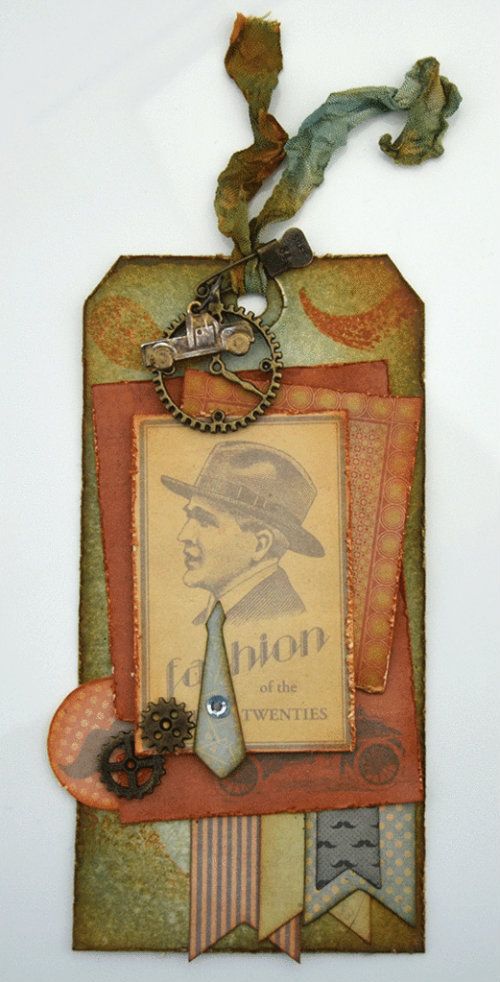
Hi there, Michele here again, this time with another Kaisercraft Sears & Son layout.

This one is grungy, misted, inked, and distressed and features a very old photo of my father as a young man. I had a feeling this range would be perfect for a vintage layout....and I think I was right. It was great to work with and I think it turned out well.

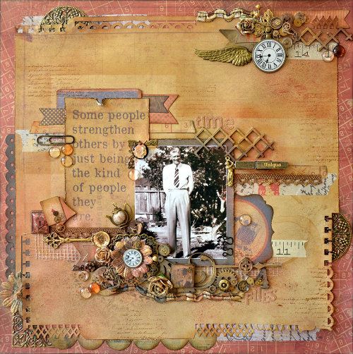
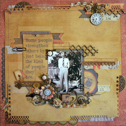
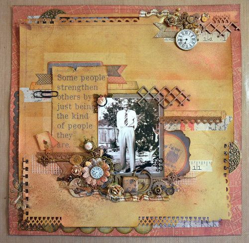
Here is the finished layout, and what follows are the steps I took to create it. Get a cuppa, sit back and relax - I think this is going to be a longish post ;)


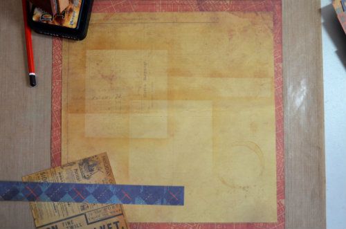
I started with two sheets of Sears & Son paper ... 'Tailor' - a rich rusty colour printed with a tan coloured grid and numbers, which formed the base: and the reverse of 'Trilby', a fairly plain, tan paper, which I trimmed down to 11''x11''. Then I cut a small piece of the black reverse of  'Charming' to act as my photo mat.


I marked the centre of the page with a pencil and then used one of the strips I cut from 'Trilby', together with the back of my photo mat as stencils. This allowed me to ink up a couple of ghost layers onto the page, using a light application of Vintage Photo Distress Ink and an Inkssentials Ink Blending Tool. I also inked the edges of both papers with Black Soot and Vintage Photo inks.


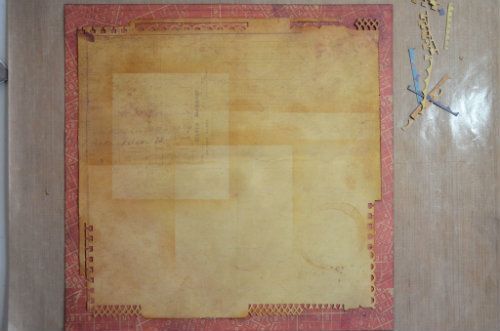
The next step was to punch the edges with various punches, distress the un-punched areas and stick the paper down - just in the centre though, so that I could still tuck bits and pieces underneath easily.


I added several things to both the outside and the inside of the page.

Around the edges, tucked under the punched out areas are some Ideaology Tissue Tape, sticky Plasterer's mesh, a strip of punched black 'Charming' paper, a green scalloped die cut piece from the Sears & Son 6.5'' Paper Pad, an orange flag - one of the Sears & Son Collectables, an Antique Bronze Round filigree (cut in half) and an Antique Bronze Square Filigree (with one corner removed and used elsewhere).

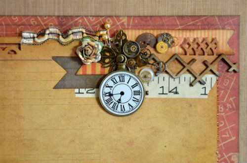
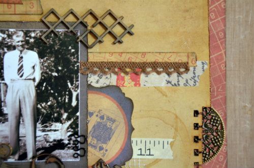
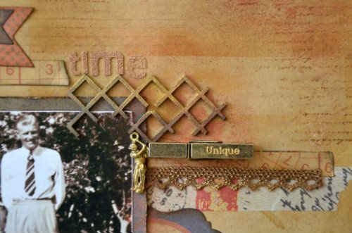
Paying attention to where the centre of the page was, and using the inked areas as guides as well, I added some strips of Tissue Tape, Washi Tape, two Flags from the Collectables pack and one cut from a strip of 'Charming', a bit more Plasterer's Mesh and the Manufacturer's strip from Moustache, torn in half and inked with Black Soot and Vintage Photo. There are a couple of extra, round tea stains there too, using Antique Linen Distrss Stain diluted with a spritz of water and the bottom of my tea cup.

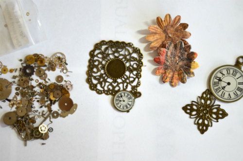
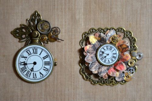
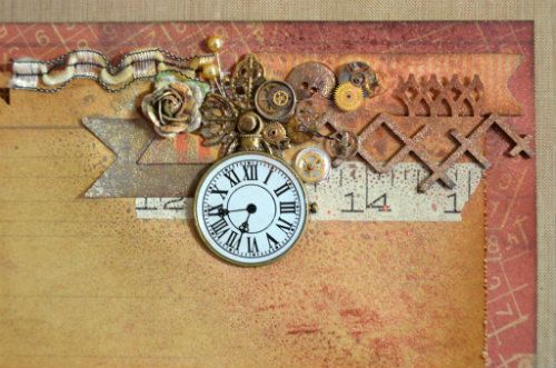
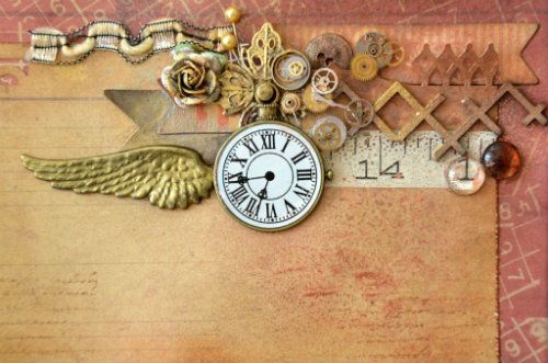
Looking at the Filigrees I had placed around the edges, I decided to use a couple more, along with some watch parts DH acquired for me on Ebay (wonderful man!) and some Clock charms from my2angels to make some matching, larger embellishments for this layout. I took these....


... and came up with these - using the Antique Bronze Square Filigree with Centre Circle, Filigree Cross, Antique Bronze Timepiece in both the large and small sizes (the larger one is the one I have linked here), two old flowers from my stash, a bronze brad and the tiny watch parts. I stuck all the bits and pieces on with Glossy Accents and tweezers and my eyes will never be the same again LOL!!


 This kind of layout tends to grow in an almost organic way, having bits and pieces added to it as it grows, so after adding my embellishments I also added a few more things and ended up with this:


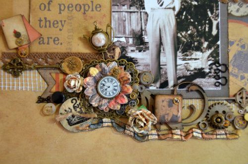
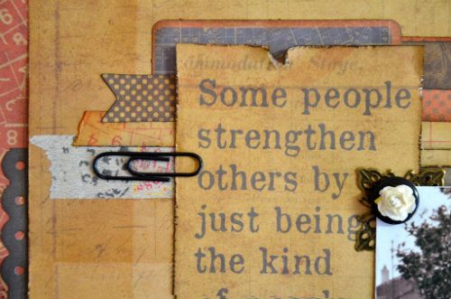
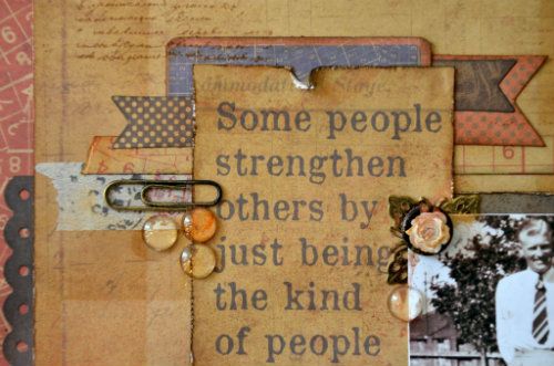
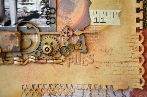
As you can see, my ''few more things'' was really quite a lot. Notably, there is a quote cut from 'Sidecar', several smaller flags from the 12x12 Sticker Sheet, some brown lace, chipboard bits and pieces - all cut from larger pieces and inked with Black Soot and Vintage Photo Distress Inks, lots more Collectables (Diamond, Ace of Diamonds, King of Spades) a die cut tag at the top of the quote from the 6.5" Paper Pad), a few Prima roses and some fibres ... I think this one was a left over from a scarf my mother knitted ...

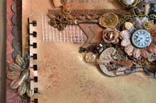
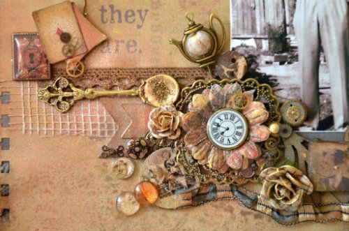
There's also a Prima wooden button, several small buttons from my Grandma's button tin, some small hooks and eyes, a paperclip and a gorgeous 
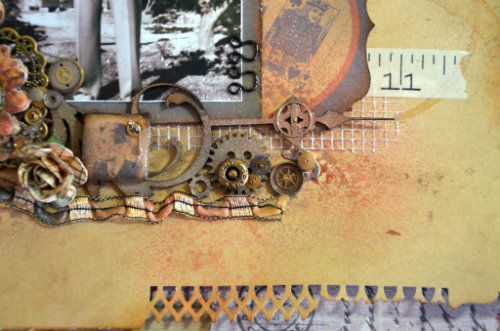
Antique Bronze Spoon, which I filled twice with Stampendous Aged Gold Embossing Powder. The second time I didn't heat it to melting point, so that the grains still show up. Love it! I made a decorative tile myself, using some Sculpey modelling clay and then covered it with a piece of paper cut from 'Charming' (a man's head). I distressed and inked the edges and added a couple of watch parts to the top.


Two pearl headed pins are stuck in at the top and a gorgeous my2angels Antique Bronze, Cream and Brown Teapot Pin fills a space at the end of the quote. How cute, and how appropriate - a cuppa and a chat fixed almost anything according to my Dad :)


Now you may think that this is the end ... nothing more to do ... but I'm afraid not. This was when I started with the misting!


I used Ranger Perfect Pearls mixed with water in a Mini Mister on this layout. This gives a gorgeous shimmer to everything, without adding too much colour. The amount of colour depends on the amount of pigment you use, so you can make the colours stronger if you want to. There are two colours here - Copper and Heirloom Gold. Here are some close-ups:


I dabbed the spray off the clock faces and the excess off the paper with a baby wipe straight away, and also covered the photo with baby wipes to keep the mist off it. Because the baby wipes are already damp, they don't absorb the spray and keep the photo clean, but you need to be sure they are safe to use on your photos as well. Depending on the type of paper you use or where your photos are processed, sometimes the wipes can damage the print. I always lay them on as lightly as possible, just in case.

The final process was a highlighting of certain areas with gold acrylic paint. You can also use Rub 'n Buff. I used my finger to rub the gold onto parts of the embellishments, for example the Antique Bronze Spoon, the edges of the roses, the lace  and the chipboard .


At this stage I also added a few more embellishments - just in case I didn't have enough LOL! There are several 10mm Glass Cabochons - some are coloured on the flat edge with Copic Markers to match the colours in the layout. There are three different browns. Because the Copics are alcohol based, they colour the glass really nicely while still keeping their transparency :)


I also added a title using Prima Canvas alphas and a metal peg from Graphic 45 (Unique).
Finally I turned a silver Angel Wing and a Man Playing Golf Charm to gold - using Versamark Ink and Gold Embossing powder.


So that's it. If you are still with me, congratulations on your patience and perserverence :) I really enjoyed creating this layout, especially adding the details, but this step by step probably took me longer to write!!

Here's the final layout again...in case you've forgotton what it looks like, way up there at the beginning of this post LOL!


Try the Kaisercraft Sears & Son range - I guarantee you'll love it!

Michele


Tuesday, September 25, 2012

New Arrivals with Carta Bella and Lots of embellishments

New Arrivals
in store now ....


 New Charms


Check out the size of them!


All Hallows Eves Collection from Carta Bella

Introducing a bewitching compendium of curiosities! “All Hallow’s Eve” beckons invitingly with a spooky sophistication. This enchanted mix of warm tones and eerie elements is sure to put a spell on you!  There are no tricks here, just a perfectly magical celebration of Halloween compiled into one amazing collection.


Alphabet Junction from Carta Bella

Alphabet Junction is bright and happy. The stickers sheets are darling and the colors are fabulous! It's a versatile collection and could be used for school, baby, or just about any child-related layout.


You can find all Carta Bella's papers here in the new section Carta Bella

If you like the look of All Hallow's Eve why not check out Carta Belle's Facebook page


Carta Bella
Announces the
All Hallow's Eve
Project Challenge
Upload your projects to Facebook
Hurry!
Contest ends October 8th


Friday, September 21, 2012

Sears & Son - Card and matching Tag

Hi there! It's Michele here again, this time with a card and tag I made using Kaisercraft's Sears & Son.

I know that I'm just a wee bit late for Father's Day with this one, but I wanted to showcase the Sears & Son Range, so I used a sentiment from the Rubons for my card even though Father's Day has come and gone again. These papers and elements are just as useful for birthdays, thank you's or any other occasion requiring something masculine though, and the sort of dusty, muted colours are perfect for anything vintage too. I am planning a layout using them for next week :)

So first the card:


I used a piece of olive green cardstock as the base, just swiping the edges with some Vintage Photo Distress Ink to tie it in with the rest of the elements I used.

On top I have added several pieces from the Sears & Son range. Everything you see has been inked with a combination of Vintage Photo, Rusty Hinge and Black Soot Distress Inks to give the individual pieces definition. Some of the edges have also been distressed.

The orange base is a piece cut from the 6.5in Paper Pad. I added a stamp to the top corner using Rusty Hinge Distress Ink and the fan of cards from the Sears & Son Clear Stamps. The sentiment and the small red pocket watch are from the Rubons pack. There are several layers on top of that, so from the bottom up.... 

A small card (the King of Spades) from the Sears & Son Playing Cards (you get SO many of these!), and a bracket shaped die cut from the 6.5in Paper Pad

Then four ''banner'' strips on the right hand side. The larger two are from the Collectables pack (there are also HEAPS of these...lots of great variety), and the smaller two from the 12x12 Sticker Sheet.

On top of those is a large playing card from the Collectables pack, lying on it's side - the Ace of Hearts.
I fussy cut the threee gorgeous men from the reverse of Sidecar to mount on double sided tape on top of the Ace. Tracy has cut their heads off in the photo in the store, and I cut their legs off for this card :)

Finally a thin strip of paper from Moustache to hide the place where all the other elements join up and a blue and white spotted moustache from the Collectables pack. The extras are two Mini Gears and a Game Spinner from Tim Holtz' Ideaology range and a pretty blue rhinestone.

Then the tag:


The base for this is an Inkssentials Manilla Tag #8 which has been inked with a Blending Tool using Weathered Wood, Stormy Sky, Faded Jeans, Rusty Hinge and Vintage Photo Distress Inks. I randomly stamped half-moustaches on the base in several places with Rusty Hinge Distress Ink and the stamp from the Sears & Son Clear Stamp set. 

On top of this are three layers - all distressed and inked for definition. A piece of paper cut from Sidecar, part of the back of a playing card from Pocket Watch and a very fashionable man of the Twenties from the Collectables pack.

Tucked underneath the layers are a black moustache in an orange and yellow polka dot circle and three of the large banner strips from the Collectables pack as well as a smaller banner strip from the 12x12 Sticker Sheet.

Embellishing the tag are two Tim Holtz Ideaology Mini Gears and a Collectables tie with a rhinestone tie pin.

At the top of the tag I have a piece of ribbon coloured by first misting it with water and then swiping it through the ink left on my Craft Sheet while I was colouring the tag. The colours are blended where they meet, but because I swiped each colour individually as I used it they are not muddied. I crumpled it into a tiny ball and left it to dry overnight.

Using an Ideaology Trinket Pin and a Jump Ring I attached a Silver Truck Charm which I had first embossed using Stampendous Aged Embossing Powder - Gold and then distressed by rubbing with black ink, and a Gear/Clock charm from my stash.

What a fantastic range for cardmaking!!

Michele

Wednesday, September 19, 2012

Due to popular demand

We have added an additional "make your own Handmade Flower class"


CLASS CONTENTS

Examples of what we will be making on the day include (but are not limited to):
Pink satin Chrysanthemum style (large and small) flowers
Rolled ric rac blooms
Metal blossoms
Rolled Petal Fabric flower
Organza Ribbon flower

And as a bonus – we’ll show you how to make rosettes out of ribbons and a small embellishment.


Please note basket in photo is only for display purposes

You will only need to bring your double sided tape, usual tools eg ruler, cutting knife, pencil etc and a hot glue gun, if you have one


You can book your place here


ALSO


NEW fabric flower class is now available on the website for bookings.  

CAN"T ATTEND OUR CLASSES?  

No problem!
 
We will create your flowers for you and post after the first class on the 10th October. 
 In this class you will be making no less than 10 fabric flowers in a variety of colours and also create encrusted jewel centres which you can make at home and add to future creations for some glitz and glam! 


To view all our classes click here


Monday, September 17, 2012

New arrivals and playing with Prima Craftsman

New Arrivals

25mm Glass Cabochons

Create you own glass pebbles, like Prima and Websters sell.
These also fit perfect inside a bottle cap (I get my caps from woollies for approximately $3.99)
You will find them in the cabochons section 


Additional new colours to add to our 6mm glass crackled beads range. Blue, Blue and Brown, Brown and a dark Christmas Red. 

Make your own pins, centre your flowers with a cluster of beads and pearls or perhaps a stringed beaded banner. 


 8mm Gold Bead Caps to coordinate with our gold pins


Hi Lisa here today


When you say Prima to me - I think of Pretty , floral, flowery, pastel types of patterns and papers. SO I was happily surprised to see the Prima Craftsman Collection - a fabulous grungy style set of papers perfectly suited to the boys in my life!!!

So for this example I have chosen a fabulous background paper called Mechanic. I have then used the fabulous Crafters Chicken Wire Reverse workshop template and some Texture magic dimensional magic ( awesome at only $4.99 a tube ) to add some additional texture to the page.....


I have then cut some Black box paper and torn off the bottom to give me a rough edge. I have then roughly wiped all the edges with my ink pad. Tracy has an amazing array of ink in store - my faves are the Tim Holtz distress inks!!


I have then added some widgets paper across the first piece of paper. I also cut out some of the pieces from the Craftsman Engineer paper and used these as random addons under the existing layers of paper.

I have also used some of the yummy chipboard COGS that Tracy has instore. I have colored these with my inks and a sponge and adhered them to the sides of my photo.


I have then cut some small strips of the
Tim Holtz film strip ribbon . 
I SERIOUSLY love this stuff and its awesome for boyish layouts - well its awesome for any layouts and I cant get enough of it !!!!


I also used a
Kraft bag with white tag for my journalling. I wanted this to fit in with the grungy feel of the papers so I used my walnut stain distress ink and wiped it around the edges and across the front of the envelope and also the tag for added grunginess!! 
To this I have added a gorgeous spanner charm!!
How gorgeous is it!!!!!


and here is the finished item!!!
To see the complete range of Prima Craftmans click here

LISA