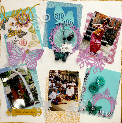
Based on last month's post, How to scrap those pesky un-matching photos, I created a similar layout to use in my scrapbook class:
This time I used the Brilliant Blue Flutterbies, but look at all the colours you can get!
Find them all in the Flutterby section here
In my class at Scrapulous everyone gets to bring their own papers and choose their own colour scheme and I thought I'd let you take a peek of how wonderfully different everyone's turned out! Some of these photos were taken at night, so please excuse the bad lighting.
Here are a few using the Perfectly Pink Flutterbies:
It's always amazing, how different they all look, simply based on different colours and photos!
Feast your eyes on some Classic Tones Flutterbies. You can never go wrong with black and white, it simply matches everything:
Here, some of the white flowers were sprayed yellow:
The Seeing Green Flutterbies are bright and cheerful, you can't help but love them and the wonderful layout they were used on:
Turquoise is my favourite colour and how happy do the Totally Turquoise Flutterbies look on this layout:
They even brighten up an otherwise soft and subdued colour scheme:
As the name suggests, the Brilliant Blue Flutterbies are, well, brilliant:
And if bright colours aren't your thing, how about the beautiful soft colours of the Autumn Tones Flutterbies. Just like the black and white set, this one goes with a lot of different colour mixes:
This last layout is a little special because it not only uses some of the elements of the Perfectly Pink Flutterbies, but also a few extras:
and a few other my2angels embellishments
(find similar ones here under Wings and Things):
I hope you feel inspired from seeing so many ways to use the beautiful Flutterby sets. Head over to my2angels and find your favourite set here!
Love


